Saturday, July 29, 2006

You, Me, Geometry, Agnes, Ellsworth, Julie, Eva


Two posts from you. I’ve got some catching up to do!

You talked about my Lush Minimalism, which I’ll respond to momentarily. But since we’re connecting dots and crossreferencing, I want to talk about the luminous geometry of your HTML drawings and the organic geometry of your paintings.

Of course I realize your HTML drawings are not paintings. There’s that issue of the lack of paint, as you point out. But your organization, your palette, your sensibility is that of a painter, not of a printmaker (though you can print the images) or a graphic designer (though they are designed on a computer the way, I’m guessing, a graphic designer might organize elements). So I see and think of them "paintings" even though you call them "drawings" --hey, there's no pencil involved, either. There’s a broad definition of "painting" and "drawing" these days, so whatever you call your work, it is the work of a painter. And I love the parallels between the luminosity of your pixels on a monitor and my paintings on panel, because in both instances the work is illuminated. Yours are actually illuminated from the inside out; mine are illuminated from light that penetrates and then illuminates as it reflects from the inside out. (Very astronomical, sun and moon, this light thing.)


Apropos of illumination, I'm posting a new painting of mine. Can you post one of your HTML drawings? I can't lift it from your site.
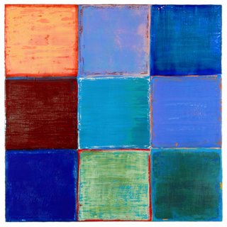
Joanne Mattera: Uttar 298, 24" x 24", encaustic on panel, 2006

As for your actual paintings, they are geometric and organic. The color appears quite luminous. The paint is not thick but is sensuous nonetheless. I want to describe them with words like "organic geometry" or "biological geometry." Your organizing principle and your materials are compatibly opposite. In your work, as in Anne Truitt’s, whom you mention, the opposites invigorate the work. (Judd I never could warm up to. All the color in the world can’t warm up his work for me. )
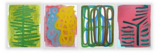
Chris Ashley: Untitled 1, 2005

Chris Ashley: Untitled 2, 2005


While the grid appears to be your organizing principle, and certainly your mode of installation, I see your work and think "life." There’s the suggestions of cells, ribcages, lungs, leaves, trees, landscape. Your color, though, is less about earth and the body than it is about a painter's palette. The scale is both micro and macro. And then there’s your work that is overtly landscape, though reductively so, such as your Six Paintings for a Room in Berkeley.

I think that compatible complementariness is what makes your work strong--and what connects our work as well. You mention Agnes Martin. Subtle tough her work is, it’s the complementariness of the handmade line, often with visible pencil dots to mark the measurements, and the visible brushmarks that give such power to her rigorously simple horizontals.
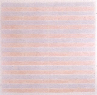
Agnes Martin: Untitled (taken from the web; no specifics given)

By contrast, I never warmed up to Ellsworth Kelly’s paintings, because they’re too flat, to non-hand for me. (His sculptures, though are a revelation. The substantiveness of the materials against the simplicity of the construction. Ah!)
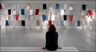
Ellsworth Kelly: Sculpture for a Large Wall, 1957. You can see additional at: www.artseensoho.com/Art/MARKS/kelly98/kelly5.html

As I talk about your work, I realize I’m revealing my own biases. So, you want to provoke me: what is geometry in my work? How do I use it? And how not? Where does "lush minimalism" come from? What experience, what place? Let me see if I can do this in a loquacious version of 25-words-or-less.

In my interview with Julie Karebenick I tell her that geometry is secondary to color. Stripes, blocks, bands: they’re all ways to get color onto/into a painting. One of my earliest visual color memories is the wall with spools of thread in my aunt Lena’s workroom. (I spent many hours in her home from the time I was an infant.) Lena was a dressmaker who worked at home--limited options for Italian- American women, any women, in the 30s and 40s--and her spools were set onto pegs in the Roy G. Biv array. Imagine my surprise as a kindergartner when I found out that the rainbow was set up exactly the same way as Auntie Lena’s spools!

So the "minimal" part of "lush minimalism" is the repetition of one element—block or stripe—that carries the color. And even slight variations in the geometric arrangements let me explore the color and composition in different ways. The "lush" is the medium: wax. Wax, in the form of encaustic paint, is the binder for my pigment. It’s the same pigment used in oil and acrylic paintings, but wax has such substance and luminosity that I let it guide me. Of course I impose my will by scraping and digging into the surface, or simply by layering colors, but there’s a finely tuned push-pull between the painter and the paint.

The geometry in my work is simply the most straightforward means of working with color. Most of my color is highly saturated, so I’m interested in its transparent, translucent and opaque versions. Most of my color mixing takes place in layers, or by proximity, so the viewer’s eye has to do a lot of the work.

I was introduced to wax in a painting materials class in college. My response to it was immediate and visceral. I have to say that when I approach a painting, when I’m painting, I’m fairly right brained about the why and the how. I’m fortunate that I can slip into the zone—that place where brain, eye, hand, brush, paint and painting coalese into an entity with an energy of its own. Of course I can step back and think about the work, but it’s like realizing, after you've driven for 20 miles, that you've been in another place. You've made rational decisions about speeding up and slowing down, switching lanes, watching out for trafic, but you were simultaneously elsewhere. Fortunately in the studio, I don't have to worry about the other driver. And I'm safe at any speed.

If you have more to say about your work, I'd love to hear it. I feel I'm talked out about mine (for now, anyway). These are some of the the things I’d like to look at/ think about/ talk about over the next few weeks:

. Helen Miranda Wilson at the Albert Merola Gallery in Provincetown, Mass. (I’ll see her show next week when I go to the beach there for a few days of much-needed R&R). Click here to see a couple of images: http://www.albertmerolagallery.com/2006%20WEBSITE/Artists/WILSON/Helen%20Miranda%20Wilson.html

. Eva Hesse’s show at the Jewish Museum in New York (saw it last month, have been perusing my books of her work). There’s that combination of grid and looseness in her work, specifically in the "craftness" of her materials, the variety of her individual elements. Click here for more info: http://www.jewishmuseum.org/site/pages/onlinex.php?id=132&PHPSESSID=832a95eb4d33fb48579722683ac3ca86

. My own upcoming show at the Arden Gallery in Boston. No links yet. I'm finishing up the Photoshopping and working on a statement.

. In a non-blog e-mail you asked about my interest in painting with acrylic, and how that differs from painting in encaustic. I’m about to learn about acrylic gels—specifically the ones that give the work a wax-like luminosity and substance—so I’ll be writing about it, probably for my own blog, but I can share.

What topics are on your mind?

Monday, July 24, 2006

Lush Minimalism

I think your term, "lush minimalism", is very descriptive of and apt for your work. The grid is a fairly constant structure in your work, as you talk about in your interview with Julie, yet you do things by throwing the gird off-center, or not completing it, or using a fragment of a grid. And Julie, says, "And you obviously revel in color; no minimalist sensibility here."

Interestingly, Tyler Green wrote today about Anne Truitt. He mentions Judd's early 60's critique of Truitt's work, saying, "The work looks serious without being so," in particular referring to her color and the divisions on her boxes and planks, and yet there he was in the 80's using lush color, too, with colored Plexiglas.

Green also talks about where Truitt was from, in Eastern Maryland, and the low elevation and the flat, far distances one can see. Her work seems about place, color, light. My friend, George Lawson, said when Truitt died that she should have the same recognition that, for example, Agnes Martin has (and I add, perhaps she didn't because she raised a family, never lived in New York, and didn't have a mythology surrounding her art such as, for example, Martin's break from painting and living in the desert, or Judd's scale of activities as a critic, 101 Spring St., and Chinati in Marfa, TX).

These are all artists using the grid, or right angles, or box-like forms.

Your work seems to be working somewhere in this same territory as far as form and a kind of interiorization of place, but of course, it is way more lush. I also wonder whether the fact that you primarily paint on panels is a contributing factor, since it gives your work a more solid body than if it were on canvas, and so there is this feeling of solidity to the paint that is like a frozen liquid.

Jerry Cullum wrote in a review in Art in America, March 2000, "These pictures display formal rigor exquisitely combined with the imprecision inherent in Mattera's medium." You never have precise, hard edges- there is always a flow, the mark of the brush, depth, bits of crust or small pockmarks. Your work, like my HTML drawings, seems to be working against a kind of rigid, almost static geometry.

All of this above just a beginning way to poke at you- what is geometry in your work? How do you use it, and how not? Where does this "lush minimalism" come from, what experience, what place?

Monday, July 17, 2006

Gee-oh-my-tree!

I'm going to skip the apologies and explanations for taking more days than I expected to write here. You've heard them all before. I'm cutting myself some slack and excusing myself for now because I think we're still figuring out how this dialogue will work and how to fit it into our busy lives. And that may just be the way it's going to be for awhile until we establish a rhythm.

I want to go back to your first post in which, while referring to some things we have in common, you wrote, "The second is our own individual work. Specifically, I’m thinking about our recent shows—your HTML drawings at the 1708 Gallery in Richmond, Virginia, and my paintings in encaustic at the Marcia Wood Gallery in Atlanta—because our work shares a geometric sensibility and, despite our extremely different mediums, a similar kind of luminosity."

The geometric question is a tough one for me to address immediately. I don't know the answers off the top of my head. I like to work out ideas through either writing or conversation, and of those two modes writing gets me closer because of the pace and possibility through revision of greater precision. I recently had to confront this when writing a statement for Geoform.net, which I was recently invited join. Not everything I wrote made it into the final statement, but in reading the first draft Julie Karabenick, one of the editors of Geoform, picked up on what she thought was a hint of perhaps the accidental or ambivalence (not her words) on my part about geometry; something having to do with my use of HTML for making drawings as kind of an acquiescence to the medium; in other words, I didn't choose geometry, but I chose to use it because the medium itself, HTML, is necessarily geometric. I didn't say this outright in the statement, but she picked up on it in a few things I said, which was perceptive, and it made me think about this issue.

The HTML drawings are one aspect of my overall body of work. Some drawings (on paper) I make have ruled lines or brush strokes, so they appear geomtric. But generally, my paintings are not geometric in the sense of Geometric Art. Sure, I may use the occasional straight- usually hand-painted, as I rarely use tape or anything to make a precise edge- but my paintings are more... what? I'm trying to avoid a whole bunch of words like loose, open, organic, biomorphic, naturalistic. All of this language, detached from an image, can prove so misleading. I will just say that my paintings are often about landscape or architectural spaces and the place of the figure in them or, the idea and/or feeling of the viewer as that figure, either through a visual, physical, or memory experience. More importantly, though, is that they're paintings, and they share in the gestalt of what a painting is through history: support, form, line, surface, mark, paint, color, image, object.

(BTW, the HTML drawings are not paintings, because they don't completely share the painting gestalt. They have: support (monitor), form (cells), line (barely, and often tied to form), color (plenty), and image. The surface of the HTML drawing is the monitor, so it's constant and without variation, so it doesn't count for me. The remainder of what's missing are mark, paint, and object.)

I have always had an attraction to minimal, geometric or hard-edged painting. I'm a big fan of John McLaughlin (for those of you who don't know who he is, perhaps you can read this or that or here and look at these or those). There are all kinds of names we throw around: Constructivists and Suprematist, de Stijl, Conrete, Mondrian, Newman, etc. And I've written plenty about minimalist or geometric-family artists, plus all the interviews I've done for Minus Space.

But the thing is, I have never myself been able to make work that I would call geometric. I just don't want to do it. I'm not neat and tidy. I'm not a taper. I don't make work that goes to all the edges, that is even and uniform. I have a very strong case of approach/avoidance regarding craft. I use the grid a lot, and I might start a painting with some kind of system or order to it, but I always break it down. I want to make an image that is, and feels to me, composed and built, rather than found, and if I use the grid too much, or other kinds of constructed forms it feels "found" to me. So I skirt around architectural form a lot in painting.

Maybe the best thing to do is to quote my Geoform.net statement, because I think it says much about how this use of geomtric imagery came to be in the HTML drawings. I will add that much of what I wrote below, and much of what I'm writing here in general, is not something I knew going into the work; instead, it is what I learned about what I am doing over time, looking back, writing about it at various opportunties.

I use HTML to make tables with colored cells that are rendered by a web browser as an image. I make one drawing every day to show on my weblog. The images are not made to be printed, and they are not plans for “real” paintings. They are simply what they are, meant to be seen on a monitor, framed by the browser, within the window of an operating system, in the serial, chronological, hyperlinked context of a weblog. Each drawing is typically one in a series, and is also meant as an individual, stand-alone image.

HTML is a simple medium with many limitations. It is inherently and inescapably geometric. It consists of right angles, straight edges, smooth and even surfaces. The range of color is confined to the possibilities of the monitor, which ensures a uniform intensity. However, I find a great deal of freedom working within this medium, and despite these limitations, since the HTML drawings exist on the Web, they are extremely portable and easy to disseminate, brilliantly backlit by the monitor, and instantly viewable and linkable. Since 2000 my weblog has been a studio wall, a gallery, and an archive.

Each series of HTML drawings has a subject (topical, historical, personal), explores one or more formal problems (color, shape, line, format, visual effect), and provides a technical challenge (making an HTML table do things it wasn’t intended to do). A series may last ten, fifteen, or twenty-five days, but recently each series has lasted exactly one calendar month.

The idea of making HTML drawings occurred to me as a way to integrate images into a weblog without needing an additional graphic file. Computer icons comprising a small grid of pixels were an early inspiration, and the earliest drawings resembled enlarged, blockier icons. The HTML table allowed me to follow my natural attraction to the grid and abstraction. Over time, as I have pushed the medium, the images have become more dynamic, complex, and expressive. In recent HTML drawings I have used animated GIFS and JPEG backgrounds.

Even when using geometric form there is still the impulse to make an image that is surprising, dynamic, and expressive. In a medium where it's easy to make perfectly measured grids the challenge is to go beyond the expectation of given order and structure. My goal is to make an image that the viewer relates to as something beyond a bunch of rectangles. I want to make images that encourage associations to nature, the body, place, thought, sound, language, social relations, and history.


So, I am often working against and trying to break down the resistant rigidity of the HTML table, and there are little things I do to distract the viewer away from the geometry: gradation, shadow, overlap and looping line, shifts in alignment, associations to forms that makes one think of something other (a door! a building! a space! a figure!) than geometry (a vertical rectangle! a taller rectangle! a square! a spiral!). Sometimes I think it works.

I titled this "Gee-oh-my-tree!" when I originally started this post several days ago and didn't get too far. This was probably just some stalling disguised as phonetic wordplay on my part, buying time to think how to write about this. But I actually think the title means something to me. One obvious thing is that my need to break down the word is part of my need to breakdown assumptions about an art that appears to be something that one might label geometric. But also, I think the feeling I get from breaking down the word "geometry" into the sentence, "Gee, oh my tree," tells something about how I look for and take from geometric structure in nature. This is where a lot of the images- on canvas, paper, and in HTML- come from.

I agree that we have luminosity in common, but also each are quite different: mine are more luminescent from a distant, and yours up close. I'd have to comfirm this by looking at one of your paintings again, but I think the kind of depth and luminousness in your paintings becomes much richer up close; not that they don't have it from a distance, but even more so up close when one see the layers and is closer to the light reflected from the depths of those layers. For me, one of the best ways to get the full effect of the HTML drawings is from a distance, say five or six feet; the light off the monitor needs to travel a bit. When one's eyes are too close to the monitor, within a couple of feet, which is the routine distance, I think we just don't see the light in the same way. In my paintings I'm usually after a more naturalistic light, and a more pictorial kind of light rather than an intentionally physical, experiential kind of light.

Monday Evening: Coming From Many Places Myself


Hey, Chris--
My Monday evening is following your Saturday evening by a week and two days. I guess this blog is going to chug along in fits and starts.

Actually, life has just gotten a tad easier, so I expect to be more communicative. My two summer workshops (at Montserrat College of Art in Beverly, Mass., and at Maine College of Art in Portland) are over, and the painting for my September solo at Arden Gallery in Boston,
http://www.ardengallery.com/next_exhibition.htm, is complete. There’s still plenty of post-painting work to do, but the standing-over-the-hotplates part is done--and not a moment too soon, with the heatwave here in the Northeast. You don't have to deal with 95-degree heat in Oakland, but it's part of the dog-day experience here.

Here’s an image from the upcoming show. It’s part of my ongoing Uttar series, but its foursquare geometry dovetails with the reductive color fields of the newer Silk Road series. By the way, I was so taken with a phrase you used in writing about Silk Road in your blog, http://www.chrisashley.net/weblog/archives/week_2006_04_16.html#001365 , that I snatched it up for the title of my show: "Heat of the Moment."

Joanne Mattera: Uttar 294, encaustic on panel, 36 x 36 inches, 2006


I wanted to respond to your essay and comments about Mel Prest’s work. Top notch, both the writing and the painting. I first saw her paintings last year at Gregory Lind in San Francisco. So simple they are: line after line of color. But so complex is the result, deep of space and luminous of color. Of all the work I saw, her paintings stood out. So for you to choose to write about her work, well, I know we’re doing the right thing with this blog. I particularly liked your description of the visual energy of her work as "a kind of force that seems to lift the painting off the wall."

More generally with regard to your writing I like your concept of language as carving, as sculpture. Certainly well-shaped writing takes us into a dimensional space conceptually. As an artist I’m appreciative of the continuum of creative effort. It’s not a continuum that exists linearly so much as it exists sequentially and simultaneously in two and three dimensional space. An idea that exists in my brain is expressed by my hand and given substance by my materials; it continues into the universe as a tangible object where it is seen by others in person, or as a conceptual object on a printed page or as pixels of light in a cyber screen. Seeing the object or the image dimensionalizes the work in another person’s mind. Written commentary about the work creates another point in that conceptually dimensional universe from which to perceive the work. And of course each person’s perceptions of the work, and of the writing about a work, create additional dimensions in which the work exists.

I think I’ve just described holographic nesting dolls projected in a hall of mirrors as seen on a webcam, but you get my point, right? Or maybe I’m just punchy. I’ve been traveling.

I gave a workshop in Portland on Saturday, at the Maine College of Art (MECA), "Getting to the Next Step in Your Career: Ten Things You never Learned in Art School." Don't get me started about the failing of art schools to prepare their students for a life in the art world. It's better now; kids are learning what they need to know to launch their careers, but many artists at midcareer are struggling because they never got the information in school and haven't figured it out. If you went to art school in the 60s and 70s, there was this idea that art and commerce weren't compatible. Uh, like what's paying the studio rent, drawings? (Actually quite a few artists at midcareer have traded paintings or other artwork for dental work, legal help, and probably rent. My attorney has one of my paintings in his office on Worth Street. But bartering takes one only so far.) Anyway, I'm glad to share what I've learned and to be paid in the process.

Man, Portland is a nice city. Small, clean. Sweltering the day I was there, but normally quite pleasant. Given the art college, there’s a strong creative community manifested by some good galleries: The Aucocisco Gallery,
http://www.aucocisco.com/ and June Fitzpatrick, www.junefitzpatrickgallery.com; the Institute of Contemporary Art at MECA, http://www.meca.edu/GalleriesExhibitions/ICA/Overview.aspx , and a raft of artists' studios that open their doors to the public on First Fridays. I’ll be back up in the fall to do another workshop and will take pictures then.

The drive up 95 was my first trip with a GPS. If you think Mapquest is convenient, wait until you have a map with a route taking shape before your eyes, numbers to tell you how far away the next turn is, and a voice to tell you when to take it. My EZ-Pass doesn’t work so well when the GPS is on, though. I guess technology has its limits.


When you have a moment, talk to me about geometry.
Over and out for now.


Saturday, July 8, 2006

Saturday night: art comes from many places

This weblog moves our email conversation to the web and makes it public. We have made a commitment to each other to some kind of regularity, and to exploring some issues about our art and art in general. This moves our conversation to a more self-conscious, intentional, and definitley public level. It's exciting.

Joanne, I will confess that I've spent the past few days watching more World Cup and Tour de France than I have painting or writing. I'm not really a sports nut at all, but besides the occasional baseball game I do really enjoy following the Tour every July, and the World Cup is particulary exciting, partly because it is an international event, but especially because of the spectacular play. Typically, I sit on the couch playing guitar while watching the coverage, and I feel very content. Tonight, as I write, my notebook is on my lap and the TV is on to coverage of today's time trials, so between typing I peek up to see what's happening; right at this moment Robbie McEwen has just launched down the ramp to begin his leg.

I went to an opening of a group show at the Richmond Art Center this afternoon called Microcosm. The curator's statement specifies that this show includes Artists who take inspiration from patterns of the natural world) (and I suspect that that link will eventually expire, since it isn't specific to the show, but it's okay for now). The reason I went is because Mel Prest is in the show, and I recently wrote an essay about her solo show this past April at Gregory Lind in San Franciso. It was the first time I'd met her, though we've emailed back and forth a several times the last few months. Openings are not good for really looking at the work, so it's a little unfair perhaps for me to say that the show was a little uneven, but it was good to see some of the work, to see Mel's paintings again, and to finally meet her.

Not that I'm a total slacker- since I have a commitment to making an HTML drawing everyday for my weblog, of course I'm drawing regularly; that commitment is a very good thing for me- something visual everyday. I can count on this. I have to make an image to show everyday. I have to enter and work within that certain mentality, that certain spatial psychology, a place beyond language, to make something that is only about looking, that comes out of the organic process of making an image.

Mel asked me something about writing about art, whether it's words or visuals first. For me it is absolutely the visual first, and language second. Language is the reification of seeing (although, seeing can be enough, and really need not be extended to the body of language). Seeing is the primary process, and language is the place of conscious cognition. Seeing is a visceral, emotional understanding, and language is a highly conscious, structured, intellectual kind of understanding. Seeing as an intelligence is underrated. Sometimes I think that language as an intelligence is overrated. Writing is hard work; it is a kind of carving, a shared forming of understanding.

I described to Mel writing as sculptural- that's why I use the word carving. Hacking and hewing, finding the right words, the right phrases, the right order of things for explication. Writing, using language is spatial; there is building an argument or an explanation, there is order, there is shape.

To talk as language as a kind of sculpture is for me the third case of referring to sculpture this week. I think shaping is on my mind. We have a plum tree in our front yard that is a little out of control. The previous owners didn't prune the tree well, so it hangs over the fence, is too tall, has too many thin branches hanging with plums filling the middle of the tree. For the past year I've been looking at that tree and telling myself that it has to be dealt with. Finally, I bought one of those pruning and sawing tools that extends up to about eighteen feet, and I've begun very carefully pruning away. I told my neighbor that it's a slow process, like sculpture; it's more than simply cutting and topping off branches. I want to carefully remove branches here and there so that in the end we have a tree with a better shape, a better system of branches and fruit, and something that will be easier to maintain in the future.

I was also talking with a co-worker about watching the World Cup games, and about understanding the play as a series of spatial strategies. Players shift and position themselves around the field, the ball is a focal point, and if one takes each series of plays moving the ball up and down the field there are little performances that seem something like sculpture to me. Watching the replay of a shot on goal, for example, there is a setup, a series of moves, a certain kind of form and beauty. That sequence of movements is just brief enough to mentally capture, and it's possible to see the shape of that play, almost like calligraphy. Likewise, in the Tour, in certain legs there are times when teams work to move a rider into position, and the beauty of this is how the riders work together and strategize to block other riders and move one rider into position. There is form to that, a sequence of shapes, a goal, and a very physical, emotional movement with its own intelligence.

So although I may not have painted much this past week, through writing, pruning a tree, and watching the Tour and the World Cup I am still exercising my visual muscles, thinking about form and compostion, shape and line and color. I truly do think of writing, of everyday life, of other media as informing my art. I like to think of it as all one thing, a very organic experience of life that informs my art. Art can be a career, but it is also a way of life. What does that mean? What is the place of art in life? What does the practice of art mean to the artist's inner life, and what is the place of one's inner life in art that is made for others to see? This is something I want to think more about, and if possible hear about from you.

In response to your last post: the collaboration you mention is with Douglas Witmer, an excellent painter from Philadelphia. I wrote an exhibition proposal to the University of Dayton, Ohio called Across the Borderline outlining a plan for Douglas and I to do a collaborative drawing installation. The proposal was approved and we are on for January 2007. Exactly what we will make will be worked out this summer. We will make separate drawings, draw on each other drawings, and install these across nearly sixty feet of wall space. The drawings will be regular drawings on paper, digital drawings, and combinations of the two.

Vaguely, what I have in mind are two individual drawing installations that move across the wall to merge into a larger joint collection of collaborative drawings. The title, Across the Borderline, has to do with our two different approaches, our geographical distance, and a kind of merging of two approaches and sensibilities in the middle, our work having literally and figuratively spanned some kind of distance. I am really looking forward to this because I like Douglas and I like his work, and there is nothing like a commitment to get the juices flowing.

We have a weblog for the project that has the proposal, the floorplan, and some beginnging thoughts, and we plan to build this weblog over time as documentation to our process, the work and the exhibit. Consider this post the offical announcement of our successful application and the weblog: Across the Borderline.

I'm going to end this post here, but I want to respond later to your mention in your previous post about our "shared geometric sensbility." I had a recent realization about my use of geometry: incidental or intentional? More to come.

Tuesday, July 4, 2006

Commonalities

So, Chris, finally we’re Two Artists blogging! July 4 is as good a time as any to begin. When else can we get fireworks to accompany the launch?

I’m thinking about two issues that interest me.

. The first is the idea of collaboration. You are about to begin a drawing project with an East Coast artist. I collaborated with a painter about a decade ago. Mine was a summer project that resulted in a small body of work, twelve 12x12" paintings. While it was great fun, a welcome change from the isolation of the studio, the project opened up my own work in unexpected ways. I’ll tell you more about mine, if you tell me more about yours.


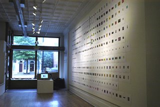
. The second is our own individual work. Specifically, I’m thinking about our recent shows—your HTML drawings at the 1708 Gallery in Richmond, Virginia, and my paintings in encaustic at the Marcia Wood Gallery in Atlanta—because our work shares a geometric sensibility and, despite our extremely different mediums, a similar kind of luminosity.

365, 2006, 365 inkjet prints of HTML drawings, 11 x 8.5 inches each, installed at 1708 Gallery, Richmond, VA, May 2006. Photo Pete Baldes, 2006

Installation from Silk Road, each painting 12x12 inches and (Uttar
292), 48 x 67 inches, at rear, installed at the Marcia Wood Gallery, Atlanta, Aprl-May, 2006

(For anyone looking in, we’re Chris Ashley from Oakland, California, and Joanne Mattera from New York City. We met in October 2005 at a gallery in Philadelphia where Chris was showing five small paintings, just a few days after Chris had seen nine of my small paintings in a San Francisco gallery. We chatted briefly, and after following up with some "nice to meet you" e-mails found we shared some points of view and began a more regular e-mail conversation. That led to JM’s idea to do a joint blog and CA’s idea to call it Two Artists Talking.)


.