Two posts from you. I’ve got some catching up to do!
You talked about my Lush Minimalism, which I’ll respond to momentarily. But since we’re connecting dots and crossreferencing, I want to talk about the luminous geometry of your HTML drawings and the organic geometry of your paintings.
Of course I realize your HTML drawings are not paintings. There’s that issue of the lack of paint, as you point out. But your organization, your palette, your sensibility is that of a painter, not of a printmaker (though you can print the images) or a graphic designer (though they are designed on a computer the way, I’m guessing, a graphic designer might organize elements). So I see and think of them "paintings" even though you call them "drawings" --hey, there's no pencil involved, either. There’s a broad definition of "painting" and "drawing" these days, so whatever you call your work, it is the work of a painter. And I love the parallels between the luminosity of your pixels on a monitor and my paintings on panel, because in both instances the work is illuminated. Yours are actually illuminated from the inside out; mine are illuminated from light that penetrates and then illuminates as it reflects from the inside out. (Very astronomical, sun and moon, this light thing.)
Apropos of illumination, I'm posting a new painting of mine. Can you post one of your HTML drawings? I can't lift it from your site.
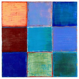 Joanne Mattera: Uttar 298, 24" x 24", encaustic on panel, 2006
As for your actual paintings, they are geometric and organic. The color appears quite luminous. The paint is not thick but is sensuous nonetheless. I want to describe them with words like "organic geometry" or "biological geometry." Your organizing principle and your materials are compatibly opposite. In your work, as in Anne Truitt’s, whom you mention, the opposites invigorate the work. (Judd I never could warm up to. All the color in the world can’t warm up his work for me. )
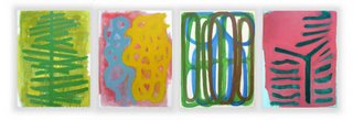
Chris Ashley: Untitled 1, 2005
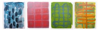 Chris Ashley: Untitled 2, 2005
While the grid appears to be your organizing principle, and certainly your mode of installation, I see your work and think "life." There’s the suggestions of cells, ribcages, lungs, leaves, trees, landscape. Your color, though, is less about earth and the body than it is about a painter's palette. The scale is both micro and macro. And then there’s your work that is overtly landscape, though reductively so, such as your Six Paintings for a Room in Berkeley.
I think that compatible complementariness is what makes your work strong--and what connects our work as well. You mention Agnes Martin. Subtle tough her work is, it’s the complementariness of the handmade line, often with visible pencil dots to mark the measurements, and the visible brushmarks that give such power to her rigorously simple horizontals.
Agnes Martin: Untitled (taken from the web; no specifics given)
By contrast, I never warmed up to Ellsworth Kelly’s paintings, because they’re too flat, to non-hand for me. (His sculptures, though are a revelation. The substantiveness of the materials against the simplicity of the construction. Ah!)
Ellsworth Kelly: Sculpture for a Large Wall, 1957. You can see additional at: www.artseensoho.com/Art/MARKS/kelly98/kelly5.html
As I talk about your work, I realize I’m revealing my own biases. So, you want to provoke me: what is geometry in my work? How do I use it? And how not? Where does "lush minimalism" come from? What experience, what place? Let me see if I can do this in a loquacious version of 25-words-or-less.
In my interview with Julie Karebenick I tell her that geometry is secondary to color. Stripes, blocks, bands: they’re all ways to get color onto/into a painting. One of my earliest visual color memories is the wall with spools of thread in my aunt Lena’s workroom. (I spent many hours in her home from the time I was an infant.) Lena was a dressmaker who worked at home--limited options for Italian- American women, any women, in the 30s and 40s--and her spools were set onto pegs in the Roy G. Biv array. Imagine my surprise as a kindergartner when I found out that the rainbow was set up exactly the same way as Auntie Lena’s spools!
So the "minimal" part of "lush minimalism" is the repetition of one element—block or stripe—that carries the color. And even slight variations in the geometric arrangements let me explore the color and composition in different ways. The "lush" is the medium: wax. Wax, in the form of encaustic paint, is the binder for my pigment. It’s the same pigment used in oil and acrylic paintings, but wax has such substance and luminosity that I let it guide me. Of course I impose my will by scraping and digging into the surface, or simply by layering colors, but there’s a finely tuned push-pull between the painter and the paint.
The geometry in my work is simply the most straightforward means of working with color. Most of my color is highly saturated, so I’m interested in its transparent, translucent and opaque versions. Most of my color mixing takes place in layers, or by proximity, so the viewer’s eye has to do a lot of the work.
I was introduced to wax in a painting materials class in college. My response to it was immediate and visceral. I have to say that when I approach a painting, when I’m painting, I’m fairly right brained about the why and the how. I’m fortunate that I can slip into the zone—that place where brain, eye, hand, brush, paint and painting coalese into an entity with an energy of its own. Of course I can step back and think about the work, but it’s like realizing, after you've driven for 20 miles, that you've been in another place. You've made rational decisions about speeding up and slowing down, switching lanes, watching out for trafic, but you were simultaneously elsewhere. Fortunately in the studio, I don't have to worry about the other driver. And I'm safe at any speed.
If you have more to say about your work, I'd love to hear it. I feel I'm talked out about mine (for now, anyway). These are some of the the things I’d like to look at/ think about/ talk about over the next few weeks:
. Helen Miranda Wilson at the Albert Merola Gallery in Provincetown, Mass. (I’ll see her show next week when I go to the beach there for a few days of much-needed R&R). Click here to see a couple of images: http://www.albertmerolagallery.com/2006%20WEBSITE/Artists/WILSON/Helen%20Miranda%20Wilson.html
. Eva Hesse’s show at the Jewish Museum in New York (saw it last month, have been perusing my books of her work). There’s that combination of grid and looseness in her work, specifically in the "craftness" of her materials, the variety of her individual elements. Click here for more info: http://www.jewishmuseum.org/site/pages/onlinex.php?id=132&PHPSESSID=832a95eb4d33fb48579722683ac3ca86
. My own upcoming show at the Arden Gallery in Boston. No links yet. I'm finishing up the Photoshopping and working on a statement.
. In a non-blog e-mail you asked about my interest in painting with acrylic, and how that differs from painting in encaustic. I’m about to learn about acrylic gels—specifically the ones that give the work a wax-like luminosity and substance—so I’ll be writing about it, probably for my own blog, but I can share.
What topics are on your mind?
No comments:
Post a Comment