Chris,
It seems we've both put "Two Artists Talking" on the back burner this past month. But finally--after much travel and a number of group shows, which you can read about in my own blog--I'm back. Before I jump into my topic, I want to say how much I enjoyed meeting up with you in San Francisco on November 9. Next time, one of us should take a camera to record the event, don't you think?
Manhattan is enjoying an extended minimal moment this fall. Although it’s been over half a century since reductive work made its first appearance, Minimalism’s "Greatest Hits" (and some current favorites) have been, and are, playing all over town. Is there something in the ether that has provoked a spate of related shows at the same time? Or, as in fashion, is it simply a cycle whose time has come round again? Whatever the reason, there has been a lot of Minimalism to see—and this is not an oxymoron.
Eva Hesse: Sculpture
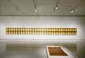
Eva Hesse’s long-overdue retrospective, Eva Hesse: Sculpture, curated by Elizabeth Sussman and installed at the Jewish Museum this summer (May 12-September 17), seems to have been the catalyst.
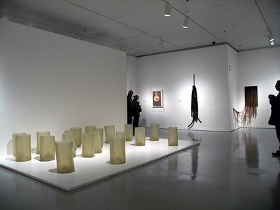
Installation view of Eva Hesse: Sculpture at the Jewish Museum, New York City, May 12-September 17, 2006
The Jewish Museum, loc
ated on Fifth Avenue’s Museum Mile, is no MoMA—there’s just one large U-shaped gallery and the ceiling is too low. Still, this was the institution that made a commitment to showing Hesse’s oeuvre after the Whitney backed out a few years ago. I was grateful to see this work in one place. As an art student in the late sixties, I remember seeing Hesse’s work around town and periodically after that at MoMA until the work’s fragility required it to be archivally sequestered. Here, it’s everything I remember and more. (And by the way, this is the same museum that hosted the Joan Synder retrospective last spring. Kudos to this museum for looking beyond the Pale Penis People—apologies, Chris, no disrespect to you personally; I’m using Robert Hughes’s phrase). 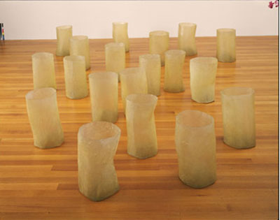 Eva Hesse: Repetition Nineteen III, cast resin, 1968
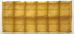
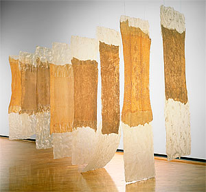
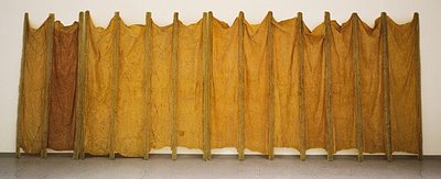
Hesse, as you well know, used non-beautiful materials—modest conventional stuff like twine and rope; industrial stuff like fiberglass; and at-the-time archivally untried stuff, like latex and resins—to effect her reductive and repetitive, and largely translucent, forms. Hesse’s great works are here: the 19 cast fiberglass vessels of Repetition Nineteen III (1968) in curatorially organized disarray; the protuberant grid of Schema (1967-1968); the multiple box-like segments of Sans II (1968); the stuffed latex and canvas panels of Aught (1968); the wall-like curtain of Expanded Expansion (1968); the latex-dipped sheets of Contingent (1969) and more.
Eva Hesse: Aught, stuffed latex and canvas, 1968
 Eva Hesse: Sans II, cast resin, shown in a segment, top, and in full installation, 1968; (segments have gone to various institutions and private collectors)

Eva Hesse: Schema, cast latex with movable elements,1967-1968. The hemispherical elements look as if they were cast from a handball. Their placement is ordered but not perfect, and each element rests unattached on the flat latex surface. This is a floor sculpture; you can see it in the tiny installation picture above
 Eva Hesse: Contingent, 1969
Perhaps because she intentionally left the trace of her process, including imperfect shapes and the impression of her own fingertips, her sculpture is as maximal as Minimalism can be—formally reductive but still resonating with Hesse-ian energy. Am I anthropomorphizing her work? Maybe. But her process—the dipping, casting, rolling, stitching, knotting, repeating; low-tech construction and the evidence of her hand—is so much a part of her work that it’s impossible not to “see” her still in the work.
Many of her two dimensional works and some of her sculptures have a decided textile reference. Her four-part Aught--latex on the front, canvas on the back and stuffed with some kind of textural material--reads not only as sculpture but as blankets or quilts. The latex and fiberglass sheets in Contingent hang like, well, sheets, though Hesse herself said something like, "It’s really a painting hung in another material than a painting." Hesse worked early in her career as a textile designer, and that might account for the way she connected her particular dots—her use of thread, twine and rope; the sheets of latex--or it may be my own background (I am the granddaughter of tailors) that sees those connections.
One thing I can tell you for sure is that time has not been kind to the sculptures. Conceptually they are as strong as they always were, but structurally they are old before their time, the latex having become yellow and brittle with age. See the difference between Expanded Expansion when it was first made in 1968 and more recently. (The paintings and works on paper appear to have aged better.)
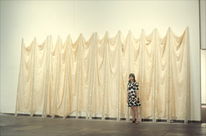
Hesse standing in front of Expanded Expansion in 1968 or sometime in the late 60s, above; a more recent shot of the work, which has yellowed (and become brittle) over time
 While the work has aged, Hesse will always be pictured as a round-faced woman in her early 30s. The exhibition includes black-and-white--and voiceless--Super-8 footage from that time showing her working in her studio. Hesse never lived long enough to grow old. Born in 1936 in Hamburg, she died of a brain tumor in New York in 1970 at the age of 34. (It comes as of a shock to realize she would have been 70 this year.)
The show is over, but the museum has produced a catalog, Eva Hesse: Sculpture, and there are a number of additional good books on the artist.
Elemental Form
Working our way geographically down Fifth Avenue, we come to Elemental Form, an impressive survey from the Sixties and Seventies at L&M Arts, up through December 9. L&M Arts is located in a 19th century (I’m guessing) townhouse in the East Seventies. For this show it's a something of a "Dia: Upper East Side." Hesse is here, as is Agnes Martin, Jo Baer (three women out of the 22 artists), and the usual suspects: Andre, Judd, LeWitt, Mangold, Marden, Sandback, Serra, Stella, Ryman and others.
There are 38 works by these 22 artists installed on two floors. The work represents everything we have come to expect of Minimalism and of these artists, in particular a reference to the grid, reductive imagery, and the repetitive elements within it. Sandback's sculpture is reduced to the simplest of lines (in blue)—two straight, two curved--defining a volumetric arc in space.
To see reductive work in what was built as a home with attention to architectural detail is at once distracting and compelling. The arabesque banister of a curving staircase, visible behind a line of four small Agnes Martin grids, brings those grids into graphic regimentation—until you go up close and see her pencil measuring marks and a slight tremulousness of line. I liked those changing relationships; it’s something you don’t see in a conventional white-box gallery. And maybe it’s because of the reductiveness of the work, but I started to see echoes of those forms in the architectural details of the gallery. The pinstripes in Stella’s T-shirt-shaped painting (Luis Miguel Dominguin II, 1960; how else do I describe that shape?) followed the form of the canvas: the notch at the "neck," the extension of the "sleeve". The echo was in the cornice moulding around the large doorway between rooms. Did the curators see that when they were installing? It was distracting, but maybe I'm just making an obsessive connection, in which case, never mind. But this is kind of funny: the HVAC grills and registers, all grids and clean horizontal slits, have never looked so of a piece within any other installation I can recall.
There’s not a lot on the gallery’s website, but the PDF press release includes images by Brice Marden, Dan Flavin and Sol LeWitt. The PDF format didn’t allow me to cut and paste the images, so check them out for yourself at www.lmgallery.com
Better still, there’s a catalog, "Elemental Form," with an essay ("Sufficiency") by Robert Storr. Contact the gallery for price and mailing specifics. (mbray@lmgallery.com) Minimalism: On and Off Paper
A few blocks farther downtown at Vivian Horan Fine Arts was another show, Minimalism: On and Off Paper, in another townhouse, with many of the same players. The focus here was on paper, in a salon-style installation, and there were four new artists included: Richard Tuttle, Ellsworth Kelly, Robert Morris and Anne Truitt (yes, I’m counting; she’s only the fourth woman in a group of over two dozen). Truitt’s sculpture, Twilight Fold, a 72 by 12 by 12" column in light sage green, uninflected by any markings, was a welcome addition to the exhibition, not only because of the sex of its maker but because of the way it held the space, a sentinel of structure and dimensionality surrounded by the multitude of two-dimensional work. As for the work on paper, I particularly liked a grouping of LeWitt, Hesse, Martin and Mangold hanging cheek by jowl. I’m at a loss to talk more about this work because of the lack of images to show you (there was no catalog, and the gallery has only an Artnet website, and work from this show was not on it). The show ran through November 17.
I can tell you that while there I ran into my friend Marietta Hoferer, a contemporary Minimalist, who makes coolly elegant white-on-white work with strapping tape on paper. Here, take a look.
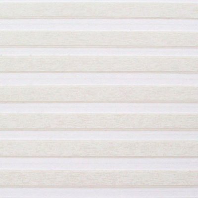
Marietta Hoferer: White 7 (detail), white artists' tape, pencil on paper; full size is 38 by 38", 2004. Hoferer's show, Fieldwork, is at the Kentler International Drawing space in Brooklyn through December 16. For more information: www.kentlergallery.com
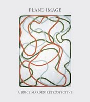
Brice Marden: A Retrospective of Paintings and Drawings
Now we take a leap 40 blocks farther down Fifth Avenue to arrive at the Museum of Modern Art and Brice Marden’s retrospective. You wouldn’t describe his recent work—those gloriously complex skeins and tangles—as minimal, but his early monochrome panels in oil and wax are as divinely reductive as an Om.
I’m going to focus on his early paintings, the monochrome wax paintings, because the later ones are not the focus of this entry. The wax-and-oil paintings are sublimely beautiful—subtle, chromatically deep—compelling you quietly but forcefully into the experience of seeing. Part of what makes them so compelling is their materiality. They are richly substantive, but the color is flat. Simultaneously you're seeing into them and looking at their surface. The tension of surface and depth keeps you traveling visually on and within the picture plane. (This is true of his later work as well, so although the image changes, the formal intent seems rather of a piece.)
For those of you who have a specific interest in encaustic, these paintings are not encaustic. Marden himself has said in a technical statement, "…oil remains the primary binder as opposed to encaustic where the wax is the binder." The early work was done in this combination of mediums because Marden wanted a uniform flatness. "That’s the reason I started using wax, to get a flat surface so you could read the colors specifically," he tells Michael Duffy, Moma’s Conservator, in Plane Image, the catalog to the show.
What I like about these paintings—the earthy dun of Nebraska, the sky-and-water referents in The Grove series, for instance—is that they are distilled to the essence of things. Again, I’m at a loss here, because I can’t access the MoMA website (does anyone else have this problem?) and so it’s pointless to talk about specific works without being able to show them. But I can show you one, which I gleaned from elsewhere (and which in reproduction is nowhere as beautifully blue/gray/green as the original):
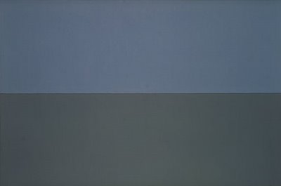
Brice Marden: Grove Group IV, oil and beeswax on canvas; two panels, overall 72" by 9', 1976
As for the drippy edge at the bottom—which seems like such an honest way to deal with layers of paint on a surface (something I like in Marioni’s work, too)—I pulled this anecdote from a recent interview with Jeffrey Weiss (an art historian and head curator of modern and contemporary art at the National Gallery of Art) in the October Brooklyn Rail, the complete text of which you can access here:
http://brooklynrail.org/2006-10/art/brice-marden"Jasper [Johns] had this penthouse/studio way up on the West Side. I remember asking him about the drips on the bottom of his paintings: ‘How come you do that?’ And he said, ‘Well, you know, you get near the bottom and you’re bending over, and you get a little tired and… It was a very Jasper kind of answer. I was very impressed by that so I, in my own way, try to allow the drips shown at the bottom of my paintings and they really were influenced by him."
Now that "they’re-not-encaustic" is out of the way, I will tell you what I gleaned from the audio tape in terms of his using wax to make these paintings--and if you go, get the tape, because you hear the artist talking about his work. (Also, you can get an artist’s annual membership for $25, a good deal considering that the one-time entry is $20. It’s not widely publicized, but if you show up with something to prove you’re an artist—an exhibition announcement or the like—you’ll get the lower-price membership.)
Marden used an old refrierator door as his palette, on which he had a hot plate with double boilers. In a coffee can he had a mixture of one part beeswax with four parts turpentine (I’m not advocating hot turpentine, just reporting). As he worked, he’d dip his brush into the molten wax mix and then into the paint and apply it to the canvas. Once the canvas was covered, he went back over it with a small cooking spatula "to basically erase he brush." He added, "It’s a very handmade surface."
Looking closeup, I can see that the wax-and-oil surface (which, unlike encaustic, was never particularly stable because it was neither wax-based nor oil-based, but an odd hybrid of the two) reveals its vulnerability and age in a couple of unsettling ways. There are scuffs and gouges, and a few instances it appears that an elbow or round-edge object has hit the canvas, creating concentric hairline cracks. But if you look at a Mondrian you'll see hairline cracks too. Perhaps, as with Hesse's work, we need to accept (within reason) the effects of time and handling.
Though I’m not talking here about the work that comes next, I urge you to see it. Those carefully meandering lines with their ghostly pentimenti—some markings smack up against the picture plane, others deep within it—merit deep looking of their own.
The newest work at the end of the show is a rather simplified version of these tangles: two six-part paintings, each about seven by twenty-four feet, that use the Roy G. Biv palette minus the "i." ("I don’t understand indigo, so I left it out," he said in the audio tape.) Rather than reductive, they just seemed simple.
My disappointment here was in direct counterpoint to my elation in seeing his work on paper installed on the third floor. Here, in graphite, charcoal and beeswax were individual and serial works with the darkest of grays, the subtlest of grids, the most nuanced of permutations from sheet to sheet. The work is controlled, meditative, formal. Themes are repeated, ideas circle around one another, planes are segmented according to the artist’s systems of order. Not to sound corny, but the work in total felt like an extended meditation.
Many of these works date from the Sixties when Marden was in graduate school at Yale. These works were contemporaneous with Eva Hesse’s. Seeing them completed my own viewing experience of the exhibitions I’ve noted here, bringing it full circle from past to present back to past. Thus it was a slightly odd sensation to walk back out onto 53rd Street 40 years later.
# # # #
Chris, as a postscript, Brice Marden: A Retrospective of Paintings and Drawings is coming to SFMoma, from February 17 to May 13, 2007, where it will be larger than it is in New York. I know you'll visit the show and I'm interested in your observations about it. And of course there's interesting reductive work in San Francisco--I'm thinking specifically about the work of John Zurier, who's based there and whom you know--so perhaps Mimimal's extended moment will extend longer still, at least between Two Artists Talking.
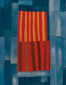 I found this show tremendously moving, not only because of the circumstances in which they were made. For a museum exhibition, it's not enough to be moved by these circumstances. Certainly, art objects made in a difficult situation can tell us valuable things about the people and their times, but for the object to be aesthetically powerful requires something more. And it seems the women of Gee's Bend found that.


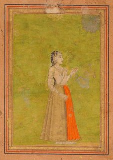 I also love miniature painting from Mughal India and elsewhere in which that tradition was practiced. (I have visited the Morgan Library many times to see illuminated manuscripts, and I'm remembering a show at the Lorenzo di Medici library in Florence in which the manuscripts were encrusted with gems. Gilding the lily for sure.) Here, too, it's the color. But also the scale. Well, the relation of the colors within the scale, and in relation to the scale. These are things I think about in my own painting, too.

