Thursday, August 31, 2006

Joanne Mattera: Heat of the Moment

May I have the honor of announcing this here:


JOANNE MATTERA
"Heat of the Moment: New Paintings in Encaustic"
Arden Gallery, Boston, September 5~30
Reception: Friday, September 8, 5-7 pm
Gallery Talk: Saturday, September 9, 1pm


Wednesday, August 30, 2006

And Still Mo' Readas

Hey, Chris--

I've got a post in formation--one that makes yet more geometric connections--and I'll get to that later this week. (My Arden gallery show gets picked up on Friday, and I'm up to my eyelids in last-minute stuff, like running out for mo' D-rings so I can attach the hanging wire. Until then, life is fragmented into blocks of no time and just-a-second.)

But following your lead, let me note that we have at least two mo' readers--so we're now up to at least nine--Daniella Woolf (Santa Cruz) and Eileen Goldenberg (SF), who are themselves collaborating. You might call them "Two Artists Working." You can see their joint effort--Eileen's clay vessels, Daniella's painted surfaces--on Daniella's blog, www.encausticopolis.blogspot.com.

Anyway, it's good to know our blog has a following. I'm witchoo for now: no reader comments. But I'm more than happy to receive e-mails about it, and to keep the shade up on our conversation.

Mo' later.

Mo' Readas Mo' Betta

And now, a little tangent from the art talk, which is my fault since I started it yesterday.

Joanne- aha! More readers reveal themselves.

Via email, Karen Jacobs emerges as #6. Her recent work uses the word Bokusho in the title; bokusho is "the abstract form of sumi-e." My talk about "Bojagi" interested her because of her own gravitation towards Asian influences.

And an old friend, Ernie (website, weblog), writes to say he's been following along- #7.

Karen wonders why we don't have comments enabled. We decided as we began that for now this weblog is a dialog rather than an open forum. We may reassess that, but for now the name of this weblog, Two Artists Talking, is what the weblog is. Personally, I invite comments and input via email. But speaking for myself, for now I like the one-to-one.

All right, back to the art talk...

I just recalled that someone else mentioned following TAT in an email, an artist/weblogger "S". #8. I'm not sure of the wisdom of having started to count our readers.

OK, and now back to the art talk.

Tuesday, August 29, 2006

Back to Bojagi

You know I'm always looking for connections in visual art. Well, maybe I'm not actually looking for them, but they seem to show up. The painting below is so of a piece with the textile bojagi you show (http://twoartiststalking.blogspot.com/2006/08/bojagi.html) that I experienced a frisson of recognition when I saw it. See what I mean:


JM: Quadrate 2, acrylic on canvas, 48 x 48 inches, 2006

In my blog, I'll shortly be posting a piece on painting in acrylic As you know, my primary medium is encaustic. I'll update this post soon with a link.

But enough about moi. Where do you think your own work will go with Bojagi? A series? And we're about to start a new month. What direction will your HTML drawings take?
Knoebel & Casentini

Another reader of this conversation, a painter, (I'm not sure if people want to be outed as a reader without their permission), wrote to me about Imi Knoebel. This painter, first initial "K", is a different reader than the person, a non-painter, who wrote to me about Schur and Wilson. So we know we've got at least two readers.

And Vincent Romaniello, who said some nice things about both of us (let me just take this opportunity to say, "Hello Vince," and to put in a plug for everyone to go on over and look at Vince's paintings), is reading this. So we have at least three readers.

And there is a fourth person, another painter, first initial "J",who also let me me know s/he is a reader via email, so for now won't be identified. So we have four readers.

Oh, and there is also someone else, another art weblogger, a painter with the first initial "D". So there, we're up to at least five known readers. We're doing our market research here.

You, out there reading this. Send me an email. If you're really fast you can be our sixth known reader.

So anyway, back to Imi Knoebel. As far as I know, he's not reading our conversation here. But he should. His ears must be burning. I whisper, "Hier Imi... Imi, hergekommen... ja, ja, es ist gut, wir ist gerechte Unterhaltung. Du kannst unser 7. Leser sein "

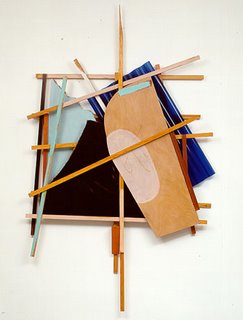
Actually, I know very little about Imi Knoebel's work. Sure, I've seen reproductions, I know of the work, I know who he is, I know of his relationship to Blinky Palermo and Beuys, I know that he's widely exhibited, but I don't feel like I know his work in any depth so that I can talk about it. Our reader "K" does, has seen plenty of the work in Europe, and endorses it a great deal. I believe I've only seen one print in person. You can find plenty of images of recent work on the web, but I just don't know very much about it. And from reproductions I like the loose constructions from the 80's, like the one above, and the Messerschnitte collages.

Back in 2003 I was in touch with someone who had been an art handler in NY in the late 80's and who had seen Blinky Palermo's To the People of New York City (1976–77) when it was first installed at Dia. The art handler wrote to me about what he had heard about The Unexpected Death of Blinky Palermo in the Tropics, "He (Palermo) made great work and disappeared. Imi Knoebel is another favorite, and seems to invoke the life of Palermo as if he were making the works Blinky would make if he were still alive." I don't know if that's fair to say or not. (You can read more of what he wrote on my old weblog, but that weblog is going to disappear in a few weeks. Poof! Gone.)

You wrote in your Miami report, "At Nachst St. Stephan booth, Imi Knoebel’s supersize paintings of pure color on thin sheets of plywood—geometric abstraction, color field painting and relief sculpture all rolled (flattened, actually) into one." That sounds good. The color, geometry, and regular measurement of his work actually make me think of some of my own HTML stuff.

So I'm hoping that between you and Reader #2 "K", and perhaps some of my own research, I can learn a little more about what is interesting about Knoebel's art.

Top: Imi Knoebel, Großes Doppelkreuz, 1985, 345 x 242 cm, Acryl auf Holz, rückseitig signier (URL)


~ ~ ~ ~ ~ ~ ~ ~ ~


As for Casentini, I'll simply say that his 2004 show at Brian Gross in SF did not impress me. I'm refreshing my memory from an email I wrote to another artist dated April 13, 2004 (neat to have an archive to draw from):
"The lighting wasn't so great I thought in the gallery- kind of harsh, showed imperfections across some of the surfaces and at the edges that, given the way the paintings are made, seemed out of place. No way could I have known from pix on gallery web site that he was contrasting thin vs. built-up areas, and matte vs. shinier surfaces. That didn't work so well for me.

And I was trying to understand the purpose for planes to wrap around the sides of the canvas, as if the planes on the front that continued around to the side were portions of a 3-D block embedded in the canvas- do you know what I mean, that he was making the canvas an object but also some of the planes on the front of the canvas began to feel like 3-D rectangles because they wrapped around the edges to the side? That and the consistently close valued, muted colors just didn't come alive for me."
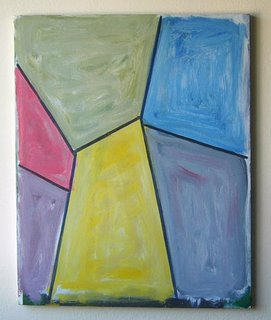

What I meant was that there was the attempt to make illusion that the paintings appear to be made up of blocks, somewhat like Carlos Estrada-Vega's blocks. But Casentini's didn't work. I hated the surfaces. I thought the matte/shiny contrasts were kind of cheezy. And in each painting he was working with a consistently closed-value, close-hue palette. I didn't like the work at all.

I used Casentini to further illustrate the difference between Wilson and Schur. Out of the three of those artists, I like Schur's work the most. I like the shaky improvisation of the paintings, the bleeding wacky edges, the intense and lush acrylic, the less predictable spaces, the way the blocks align but don't lock, and how these alignments shift in small fields allover the painting. He keeps the painting flat, has a good overall plane. Wilson is more dependent on a kind of regularity and measure. Casentini is more classically composing space.

Bojagi

Joanne, you wrote, "the edges (in the three Bojagi paintings) are straight and the angles sharp, but your geometry still has a biological feel to it. (On closer inspection, it appears that at least one of those "straight" lines has a slight curve. Am I correct on this?)"

Ahhhhhh. The hint of geo, and the biological/organic feel. That was my sort of somewhat kind of aimless intention. I think. And they're painterly. They're kind of rough. They look very fast, but they were made very slowly. Those things hung on the wall, and over several weeks I'd walked past them, take a pass at them, let them hang some more. They took a long time. I did not set out to make three paintings based on the same drawing. I've never done that before. Ever. You saw it here first- history! I tend to try to make every painting be different.
These are all painted quite differently. All are on mid-priced commercial canvases. For some kinds of painting I like that thin fine-weave canvas with the super slick commercial gesso ground. But the two smallest are actually not on the commerical side; these were unsuccessful paintings, so I pulled the canvas off the stretcher, flipped it over and restapled, and then gessoed it myself, so it's more coarse and absorbent. If you look on the backside you see a bad painting. That had never occured to me to do before, but John Zurier had mentioned to me that he did that, especially with linen, and I've now done that several times. The largest one is on the original store-bought ground, and I think the paint quality shows that.

All of the lines are meant to read straight, none curved, but they're a bit wobbly amyway. I use a small flat brush and a raised straight edged to guide my hand, but they have a hand-painted quality, especially as the pressure of my hand varies.

I think the word is pronounced BO-ja-gee. Emphasis on the first syllable, quick on the middle syllable, draw out the last syllable. I think. It's Korean, and is sometimes spelled "pogaji".

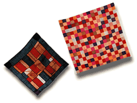
Bojagi (Pojagi), or wrapping cloths, are Korean textiles pieced together from small scraps of cloth. Bojagi have very old origins, but those still in existence date from the Choson dynasty (1392 – 1910). They are used for wrapping, carrying and storing objects, and as table coverings, altar cloths and special-occasion decorations. Bojagi are usually square and come in a range of sizes. Fabrics used in bojagi include silk, cotton, hemp and ramie. Ramie is a fiber made from the stalks of a woody shrub indigenous and unique to Korea. It can be woven into a very thin, even-textured and strong fabric that is extraordinarily long-lasting. There are many different types of bojagi including lined or unlined, embroidered, painted and gold-leafed (URL).

My younger brother's wife's parents are from Korea. So my two nephews are Korean-American. The SF Asian Art Museum has some bogaji on display. I've been carrying the idea around in my head for three months or so.

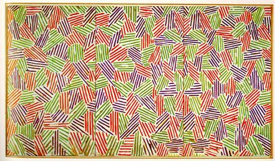
Your Jasper Johns comparison is just fine with me. I actually like those flagstone and cross hatch paintings from the 70's. I saw those paintings when his retrospective was at SFMoMA in 1978, and I still have the catalog with the long and excellent essay by Michael Crichton (who has lately said that the scientific evidence for global warming is weak). It's interesting to see John's reusing these motifs.

I saw Johns' show of new work at Matthew Marks in May 2005. It was a big event, and I happily anticipated seeing it. But I felt that the work was really cold and hermetic; there wasn't one mark out of place, everything seemed so planned, almost like a coloring book. It was a good show, but measuring against his reputation I was disappointed.

And in that photo you posted- is it just that shirt, or has John's become incredibly barrel-chested?

Tuesday, August 22, 2006

Bojagi, Jasper, Marco, Imi

I was just about to respond to your post about Casentini, Schur and Wilson and then there was another post from you. You are cooking!

I like what you’re doing with Bojagi—three separate elements, each with the relatively same composition but worked differently. Everything you noted about Casentini, Schur and Wilson applies in some degree to those three paintings of yours: the differences in size (if not actual scale); the various ways you have handled the paint and the brushwork—overlays, tints and tones, so that in some the color hovers, and in others it squeezes assertively into its particular space—and the ways those shapes fit together. Funny, the edges are straight and the angles sharp, but your geometry still has a biological feel to it. (On closer inspection, it appears that at least one of those "straight" lines has a slight curve. Am I correct on this?)

My initial response to seeing your shapes, and your fitting-pieces-together composition led me to think of paintings by Jasper Johns. His Seventies/Eighties works are composed of his famous staccato hatchmarks within each larger shape, of which Scent is an example—he did numerous prints on the theme as well--but a recent photograph of him in his studio shows work with a biomorphic geometry.

By the way, how do you pronounce Bojagi?

Jasper Johns in his Connecticut Studio, 2005; below: Scent, oil and encaustic on canvas, 72 x 126 inches, 1973-74
Re Marco Casentini, I first saw his work at the Armory Show in New York last March. I liked it, and said so in "Back For More: The Art Fairs in New York," a report I posted on my website. He was at the booth of the Richard Levy Gallery, an Albuquerque gallery whose program of geometric, reductive, abstract painters and sculptors is strong and well edited. I’m glad you included Casentini's website so that I can see more, because I didn’t see him on the Levy Gallery site. Do you know him?
Apropos of the art fairs, at last December’s Art Basel Miami, I loved the work of the German artist Imi Knobel. He makes low-relief constructions in painted aluminum that read like paintings. Paintings? Sculptures? Tomato, tomahto.
Imi Knoebel, Illia, acrylic/aluminum, 119 x 118 x 4 inches, 2002
I mentioned Knoebel on my "Joanne Goes to Miami" report. It was a brief note, the context of which was the Art Basel/Miami fair. You can see more images of his work if you click onto this link: Imi Knoebel

Chris, I have to tell you: This dialog is more compelling, more fruitful and certainly more frequent than I’d imagined it would be!

Monday, August 21, 2006

New work


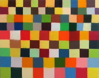
All titled Bojagi, 2006, oil on canvas, L: 18 x 14", M: 20 x 16", R: 16 x 12"

I posted a bunch of new stuff on my weblog today. In response to an email from Douglas Witmer, I wrote, expanded and edited a bit for here:

I have a lot of stuff in progress. I'm really just painting kind of whatever I want- I'm feeling very loose, and I'm very open to all kinds of imagery. What I'm doing is rolling right out of what I've been doing since around fall 2004, and getting a whole lot more comfortable with oil and all of the different ways it can be handled. I like that my approach, and the variety of the work, still feels to me part of a single overall approach, and I like that I don't feel locked into a certain way of painting. I like being able to work in bursts and smaller series, to shift gears, to have some works that belong together but are separate from another group of work. I'm liking the domestic, intimate, personal feel of what I'm doing- these are smaller issue paintings, intimate, but also painting in a way that is critical of painting and its history and possiblities, all while staying within the tradition- oil, on canvas, over stretchers, on the wall. Nothing radical? I feel that this kind of low tech approach, in the face of so many things that are depersonalizing, in a time of the absence of the original, next to so much art that is not about the unique handmade object, that this little domestic approach has the possilibity of being very radical. I'm thinking of this idea of a domestic kind of art as acoustic, like playing acoustic guitar rather than big plugged-in electric, but acoustic with a bigger idea in mind- playing acoustic guitar and recording it with iTunes to be used in a larger context than one's porch or backyard. Just thinking, just wondering what this is and where it goes. Also, I think, actually, that this approach is realistic. I have a day job. I have a small place to work. I'm very busy. I don't have hours on end in the studio. I don't think my ambition is to make ten foot paintings. I'm trying to be realistic about how painting is part of my life. I'm in it for something other....
Friday, August 18, 2006

In Painting, Small Differences Matter Big


Left: Richard Schur, three sounds: sparring - a brother's tongue, 2004, acrylic on cotton, 120 x 100 cm, Guangdong Art Museum, Guangzhou, China
Center: Helen Miranda Wilson, Tumble, 2006, oil on panel, 14" x 11"
Right: Marco Casentini, Every Sunday Afternoon #2, 2005, acrylic on canvas, 170 x 150 cm., 67" x 59"


Joanne, you mentioned Helen Miranda Wilson in your previous post, and one of our readers asked me via email about the difference between her work and Richard Schur's. I replied that I think there is a superficial similarity- bright colors, grid, right angles, stacks- but I think that ultimately they are as similar as Alex Katz and Philip Pearlstein. In other words, there are details that make their work quite far apart and about very different subjects.

While thinking about this over the weekend, I thought of other painters who paint in colored grids. You featured some in your post, and I thought of Marco Casentini, a new example of whose work I'd recently seen. My initial reaction was that it resembled Schur's work.

If one goes back and look at these three images one sees that these artists are constructing very different kinds of spaces.

First thing, though, is that these paintings are very different in size from each other. That difference can't really be conveyed here. I could scale the pictures to each other so one could see that Wilson's painting is the size of a sheet of writing paper, that Schur's painting is the size of a flag, and that Casentini's is the size of table top. But can't be conveyed here is the scale of the brushwork in relation to the size of each painting, and the depth of the stretcher, and various other things that make the experience of looking at each painting wildly different from each other. Still, I'm going to compare them anyway, right? Because that's what we do here on weblogs- we write!

Wilson's structure is more about patterning. Her grid contains more even and regular alignment. She is closer to a checkerboard. Her work feels more hand-painted, like she is using smaller brushes and filling-in the rectangles. Her oil palette uses mixed color; it seems more like traditional painting- more atmospheric, softer, more picture-like. The edges are soft. Her work is slower. I think this makes the work flatter. It feels more introverted. The space feels divided into several clusters of checkboards that hold together, rather than a cobbling together of a bunch of different rectangles.

Richard's work is more pop-like, more extroverted- the way things are stacked and layered, there is a kind of building up and falling down feeling. Unlike Wilson, his rectangles feel more cobbled together, less unitary. Things feel shaky. Partly this is because the rectangles are never exactly square, rarely perfectly laid out. He tapes, and he allows the paint to bleed under the tape. The edge and structure in Schur's work has the tremor of a slight earthquake, whereas in Wilson's work things feel knitted or collaged together. Schur does not pattern- his structure is less regular. The quality of acrylic and the brilliance of the color create the feeling of something that "happened now", intuitively. They are painted quickly, the paint is opaque, large brushes are used. Wilson's work seems more planned, like it's drawn and filled in, and that the painting happened more over time.

Casentini is sort of a hybrid between Wilson and Schur. The colored areas feel more painted-in, like Wilson, but while having more regular verticals and horizontals don't share her tendency to pattern. His planes of color have fewer vertical and horizontal alignments compared to Schur, but the space feels a little deeper and more layered. Casentini's colored planes float and hover. Wilson's are placed as partof a greater whole. Schur's irregular shapes are jammed up against each other. Each of these paintings is about an entirely different kind of space.

Even though them may seem to share some qualities of color intensity I think the light in each painting is of a very different kind. Schur's light is urban and more artificial. Wilson's light feels closer to the natural world, to the color of a lush outdoors. Casentini's light feels like the more harsh sunlight of a southern state, like the desert.

It's amazing the difference one can discover, and the different meanings possible, if one just take some time to look several times at an image, notice details, and apply fingertips to the keyboard.

Thursday, August 17, 2006

Playing with Blocks

Success. I'm logging in from my laptop and pictures are loading. This is fun again!
I’m in the home stretch for my show at Arden Gallery, which opens on September 8, but I took a few days of much needed R&R –well, really R&V (research and viewing)--in Provincetown, at the tip of Cape Cod in Massachusetts. Are you familiar with P-town? It’s an unlikely mix of Portuguese fishing village, artists' colony (summer home of Hans Hoffman and others in their heyday in the Fifties), and gay resort—a model, actually, of how the rest of the world could get along.

My timing was good, as there was a small show of small paintings by Helen Miranda Wilson at the Albert Merola Gallery. Wilson used to paint in a more lyrical botanical/landscape way, and then a few years ago turned her attention to compositions with blocks of color, as if she’d distilled her world and organized it into neat little swatches. Wilson’s oil paintings in this show are small—8 x10 to 20 x 16 inches—with squares or rectangles organized into grids in which the uniformity of shape is broken by occasional feathering as one color leaches tentatively into another, or a skew of size or out-of-step placement. Green predominates. Or is it red? Or umber? There’s a lot of give and take there, but the work remains lyrical to my eyes.
Helen Miranda Wilson, Grasshopper, oil on panel, 8 x 10 inches, 2006

Down the street at the Ernden Gallery another artist whose work I like is represented: Carlos Estrada-Vega. He’s also working with blocks, and his scale is also modest. But whereas Wilson’s paintings are flat and relatively uninflected, Estrada-Vega’s are physically dimensional. Each painting is a relief composed of hundreds of individual canvas-covered blocks that he colors with wax paint (something he calls oleopasto) that are adhered onto a metal plate by means of tiny magnets embedded in each block. The work is called painting, but it’s also relief sculpture as the individual units vary by height. There’s so much going on—the topography, the colors in quiet or spirited conversation, and textures modulating the exchange.
Carlos Estrada-Vega, Walt, oleopasto on canvas, 10 x 10 inches, 2005


I also saw the work of Boston-based Reese Inman at a terrific new gallery called Kobalt (no website yet, but the gallery info lists the URLas www.kobaltgallery.com, so presumably it’s coming). Kobalt took over the space that had been occupied by other galleries in past seasons. Director Francine D’Olympio has a keen eye and a strong program, and with gallery doors that open onto a brick patio that merges into the sidewalk, the space is not only visually inviting but physically beckoning as well.

Inman works with the grid, but she defines each square with a dot. Specifically, she paints dots that have been arranged in logarithmically patterned formats. Working on a large-scale printout that she adheres to her painting surface, Inman builds up her surface dot by dot, color over color, often returning to sand away parts of those dots to reveal the edges of the color beneath. At the same time that the work feels twenty-first-century current, the sanding gives it a distinct archeological sensibility. Reese’s new series is called Maps, and the work suggests both the means to a destination and the destination itself. You can see more on her website. She’s also represented by Gallery Naga in Boston.
By the way, both Inman and Estrada-Vega are on the Geoform site.

Reese Inman, Map 1, acrylic on panel, 24 x 24", 2006

Since I’ve been working blocks and bands for some years, I’m always interested to see how these and other other artists organize their geometry and how their palette integrates with the geometry. Indeed, "blocks of color" is a simple description, but the expression of the concept is infinitely varied and vast. And of course you are composing your HTML drawings with rows and blocks of color. (I love that the cut-and-paste mechanics of their making leads to to also think of them as collage.)

I'llI close with these few images of blocks from other other artists and cultures. Chris, feel free to add to the mix if you are so inclined.


Left: Paul Klee, Ancient Sound, 1925; and a painting, above, from 1935

Below: Mensie Lee Petway, Strips, pieced quilt, 2003

Left: Peruvian tapestry fragment


Right: Young monks in a Bhutan monastery facing a painted or tiled wall. The block pattern is very much like the the 1930s Amish quilt from Lancaster County, Pa., below
Below: Mondrian, Contexture, oil on canvas, 1930s; above: another 1930s Amish quilt. Do I need to comment on all the visual connections?

Wednesday, August 16, 2006

Drawing Center

Nice post, Chris. And I really like the HTML drawing you showed with it. There are so many reasons to like that work: the luminous color, the grid-based format with its play of vertical and horizontal in counterpoint to the horizontal and vertical, the richness within the overall sense of reductiveness. Drawing, painting. Tomato, potato.

Have you considered showing this series to the Drawing Center next time you come East?
They have a one-on-one viewing program ,http://www.drawingcenter.org/artreg_viewingprog.cfm, for artists who are not affiliated with a New York gallery. You make an appointment. Then you bring a selection of work to the Center for a free consult with a curator. It’s hit or miss in terms of the feedback and the results. I did it some years back, and I didn’t feel I got much out of the dialog, and absolutely nothing came of it curatorially. But other artist friends have felt hugely helped by the dialog, and several were invited to participate in group shows there.

I'd written a much longer post, with images, but I've been having trouble with the Blogspot post and I lost everything--pictures, text and all. This is a great picture-posting system when it works, but when it doesn't, it reall sucks. More later. I hope.


Monday, August 7, 2006

HTML as drawing


When I Met You (Pacific), 20060720, HTML, 300 x 400 pixels


Joanne, in your last post you talk about how you see my sensibility as a painter come out in the HTML drawings, and I'm glad to hear that. A few people have commented on that, and I suppose that's why people naturally call them paintings. In fact, it's very gratifying that you recognize that, because it is something I really work on, and I draw from my experience as a painter when making the images.

To be honest, when I see a lot of digital work by others I can see the lack of experience and the eye in the work, and this lack goes in one of two directions, both rooted in the inability to handle old-fashioned color, form, and composition.

The first direction is work that looks too digital, too blocky, to formless, without a good sense of color. The second direction is work that overcompensates by relying too much on the neat digital tools at one's exposure. I find the simplicity of HTML tables really freeing, and it gives me limits to push against. One of the ways to push against it is by using painterly knowledge about color, form, light. There's a way that HTML might force all of the daily work to look alike, but I think I've been able to get a kind of variety out of something that most people would've given up on long ago.

I think someone else who is really good at working against the seduction of digital work by working within some very narrow parameters is Tom Moody, and in particular his work on paper.

I call them drawings because it just seems to me historically drawing is a more flexible term, especially in post-Minimal times. For me a painting needs paint- painting is a specific medium. The meaning of drawing has for me more possiblities- it comes from disegno, design, and seems closer to idea and process and planning. There are issues of degrees of finish between drawing and painting. Drawing means all kinds of things: pencil on paper, collage or watercolor, a typewritten page, a stick moved over wet sand at a beach, a shadow on a wall, a finger on a frosted window pane. Picasso moved a flashlight in front of a camera during a time-exposure. Tom Marioni made drawings by rubbing paper with drummer's brushes. Hansel and Gretel's breadcrumb trail is a drawing. Brice Marden made drawings with wax and postcards. On and on.

And the feel of making these using Dreamweaver is closer to drawing for me than painting. I select areas, apply color in rows or columns, copy and paste sections- it feels in some way more that collage, but drawing is what it really is.

Does it matter if they're called painting or drawing? Not really- people will continue to call them paintings and I'll continue to call them drawings. Just don't call them late for supper.

More in another post.