I was just about to respond to your post about Casentini, Schur and Wilson and then there was another post from you. You are cooking!
I like what you’re doing with Bojagi—three separate elements, each with the relatively same composition but worked differently. Everything you noted about Casentini, Schur and Wilson applies in some degree to those three paintings of yours: the differences in size (if not actual scale); the various ways you have handled the paint and the brushwork—overlays, tints and tones, so that in some the color hovers, and in others it squeezes assertively into its particular space—and the ways those shapes fit together. Funny, the edges are straight and the angles sharp, but your geometry still has a biological feel to it. (On closer inspection, it appears that at least one of those "straight" lines has a slight curve. Am I correct on this?)
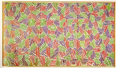
My initial response to seeing your shapes, and your fitting-pieces-together composition led me to think of paintings by Jasper Johns. His Seventies/Eighties works are composed of his famous staccato hatchmarks within each larger shape, of which Scent is an example—he did numerous prints on the theme as well--but a recent photograph of him in his studio shows work with a biomorphic geometry.
By the way, how do you pronounce Bojagi?

Jasper Johns in his Connecticut Studio, 2005; below: Scent, oil and encaustic on canvas, 72 x 126 inches, 1973-74
Re Marco Casentini, I first saw his work at the Armory Show in New York last March. I liked it, and said so in "Back For More: The Art Fairs in New York," a report I posted on my website. He was at the booth of the Richard Levy Gallery, an Albuquerque gallery whose program of geometric, reductive, abstract painters and sculptors is strong and well edited. I’m glad you included Casentini's website so that I can see more, because I didn’t see him on the Levy Gallery site. Do you know him?
Apropos of the art fairs, at last December’s Art Basel Miami, I loved the work of the German artist Imi Knobel. He makes low-relief constructions in painted aluminum that read like paintings. Paintings? Sculptures? Tomato, tomahto. 
Imi Knoebel, Illia, acrylic/aluminum, 119 x 118 x 4 inches, 2002
I mentioned Knoebel on my "Joanne Goes to Miami" report. It was a brief note, the context of which was the Art Basel/Miami fair. You can see more images of his work if you click onto this link: Imi Knoebel
Chris, I have to tell you: This dialog is more compelling, more fruitful and certainly more frequent than I’d imagined it would be!
No comments:
Post a Comment