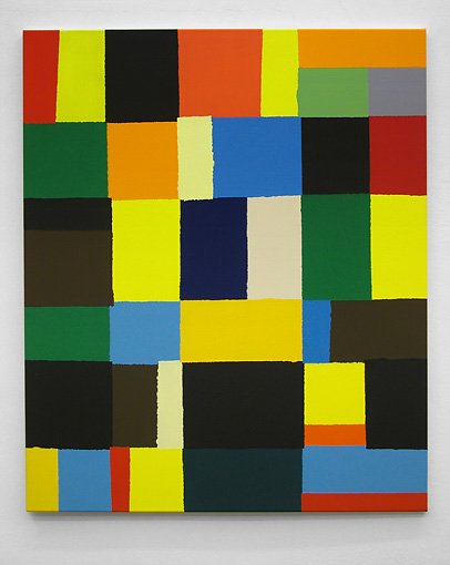

Left: Richard Schur, three sounds: sparring - a brother's tongue, 2004, acrylic on cotton, 120 x 100 cm, Guangdong Art Museum, Guangzhou, China
Center: Helen Miranda Wilson, Tumble, 2006, oil on panel, 14" x 11"
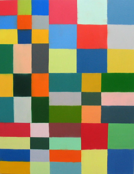
Right: Marco Casentini, Every Sunday Afternoon #2, 2005, acrylic on canvas, 170 x 150 cm., 67" x 59"
Center: Helen Miranda Wilson, Tumble, 2006, oil on panel, 14" x 11"
Right: Marco Casentini, Every Sunday Afternoon #2, 2005, acrylic on canvas, 170 x 150 cm., 67" x 59"
Joanne, you mentioned Helen Miranda Wilson in your previous post, and one of our readers asked me via email about the difference between her work and Richard Schur's. I replied that I think there is a superficial similarity- bright colors, grid, right angles, stacks- but I think that ultimately they are as similar as Alex Katz and Philip Pearlstein. In other words, there are details that make their work quite far apart and about very different subjects.
While thinking about this over the weekend, I thought of other painters who paint in colored grids. You featured some in your post, and I thought of Marco Casentini, a new example of whose work I'd recently seen. My initial reaction was that it resembled Schur's work.
If one goes back and look at these three images one sees that these artists are constructing very different kinds of spaces.
First thing, though, is that these paintings are very different in size from each other. That difference can't really be conveyed here. I could scale the pictures to each other so one could see that Wilson's painting is the size of a sheet of writing paper, that Schur's painting is the size of a flag, and that Casentini's is the size of table top. But can't be conveyed here is the scale of the brushwork in relation to the size of each painting, and the depth of the stretcher, and various other things that make the experience of looking at each painting wildly different from each other. Still, I'm going to compare them anyway, right? Because that's what we do here on weblogs- we write!
Wilson's structure is more about patterning. Her grid contains more even and regular alignment. She is closer to a checkerboard. Her work feels more hand-painted, like she is using smaller brushes and filling-in the rectangles. Her oil palette uses mixed color; it seems more like traditional painting- more atmospheric, softer, more picture-like. The edges are soft. Her work is slower. I think this makes the work flatter. It feels more introverted. The space feels divided into several clusters of checkboards that hold together, rather than a cobbling together of a bunch of different rectangles.
Richard's work is more pop-like, more extroverted- the way things are stacked and layered, there is a kind of building up and falling down feeling. Unlike Wilson, his rectangles feel more cobbled together, less unitary. Things feel shaky. Partly this is because the rectangles are never exactly square, rarely perfectly laid out. He tapes, and he allows the paint to bleed under the tape. The edge and structure in Schur's work has the tremor of a slight earthquake, whereas in Wilson's work things feel knitted or collaged together. Schur does not pattern- his structure is less regular. The quality of acrylic and the brilliance of the color create the feeling of something that "happened now", intuitively. They are painted quickly, the paint is opaque, large brushes are used. Wilson's work seems more planned, like it's drawn and filled in, and that the painting happened more over time.
Casentini is sort of a hybrid between Wilson and Schur. The colored areas feel more painted-in, like Wilson, but while having more regular verticals and horizontals don't share her tendency to pattern. His planes of color have fewer vertical and horizontal alignments compared to Schur, but the space feels a little deeper and more layered. Casentini's colored planes float and hover. Wilson's are placed as partof a greater whole. Schur's irregular shapes are jammed up against each other. Each of these paintings is about an entirely different kind of space.
Even though them may seem to share some qualities of color intensity I think the light in each painting is of a very different kind. Schur's light is urban and more artificial. Wilson's light feels closer to the natural world, to the color of a lush outdoors. Casentini's light feels like the more harsh sunlight of a southern state, like the desert.
It's amazing the difference one can discover, and the different meanings possible, if one just take some time to look several times at an image, notice details, and apply fingertips to the keyboard.
No comments:
Post a Comment